AZORES“Tudo isto, todo este azul, toda esta frescura, me entra em jorro pelos olhos dentro e pela alma dentro. A tinta azul não só ondula — estremece em pequenos grãos vivos, duma acção extraordinária, e o mundo sempre novo que me rodeia penetra-me do seu bafo e comunica-me a sua vida.” As ilhas desconhecidas, Raul Brandão
“All of this, all this blue, all this freshness, enters trough my eyes and trough my soul. The blue ink not only undulates — trembles trough tinny grains of an extraordinary action, and the ever-new world that surrounds penetrates me with its breath and tells me its life.” The unknown islands, Raul Brandão
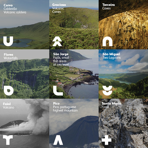
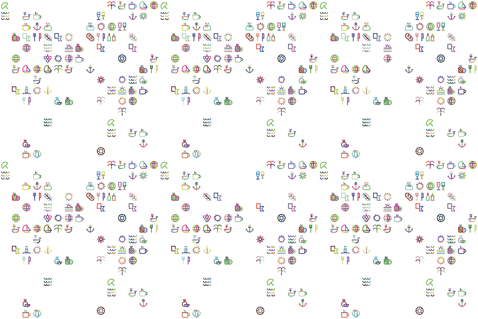
Located in the middle of the Atlantic, Azores is composed by nine islands, each one with unique characteristics that makes the archipelago absolutely distinct. Trough its geographic position Azores gained recognisable differentiation in its nature, gastronomy, agriculture, economy, tourist offering, fishery, among others. Origin In Azores it can be found several inscriptions and graphic elements made by fisherman and sailors along the course of history, this visual lexicon was used to translate iconically a symbol from from each island to create the azores and its islands’ logo. Purpose The proposal intended to create a brand not only able to represent the Azores Archipelago but also the nine individual islands and all the attributes that defines Azores. The logo works as a shifting form, highlighting an icon when referring to a specific island. Colours Raúl Brandão, famous Portuguese writer, embarked on a trip to the islands in the summer of 1924. That trip resulted in the publication of “As ilhas desconhecidas” (“Unknown Islands”) one of the works that most influenced the formation of the internal and external image of Azores. For each island Raúl Brandão gave a distinct color, this chromatic scheme was used for the identity program. Icons Due to the enormous offer of the archipelago, attach to the logo it was developed an always growing set of icons. Identity expansion Invest in Azores It was also conceived the possibility of creating new identities integrated in the Azores brand system. Azores Materials Package in Cryptomeria Materials naturally found in Azores were used through the identity system as a mechanism to strengthen the brand. Signage In Azores everything seems integrated with nature. For the signage proposal it was used basalt (a volcanic rock commonly found in Azores) designed and constructed to resemble a ruin, a piece that doesn’t conflicts with the surrounding space and integrates it. Exporting Azores The representation of Azores outside the archipelago is made by a popup store resembling a wooden container built in cryptomeria. Azores Original Product For the new identity it was also conceived a certificate program for products with Azores origin. A colored strip that identifies the origin of the product by island or by the entire archipelago. The label maintains the rules of the logo identity in terms of logo composition and colours.
Azores Identity Proposal
MPD © March 2014
|


